
React Native design tokens: one source of truth, three layers, light mode first
Colours typed straight into components work until someone asks for dark mode. How to set up React Native design tokens in three layers, test contrast automatically, and why shipping light mode first can be right.
Sadeepa Methmal

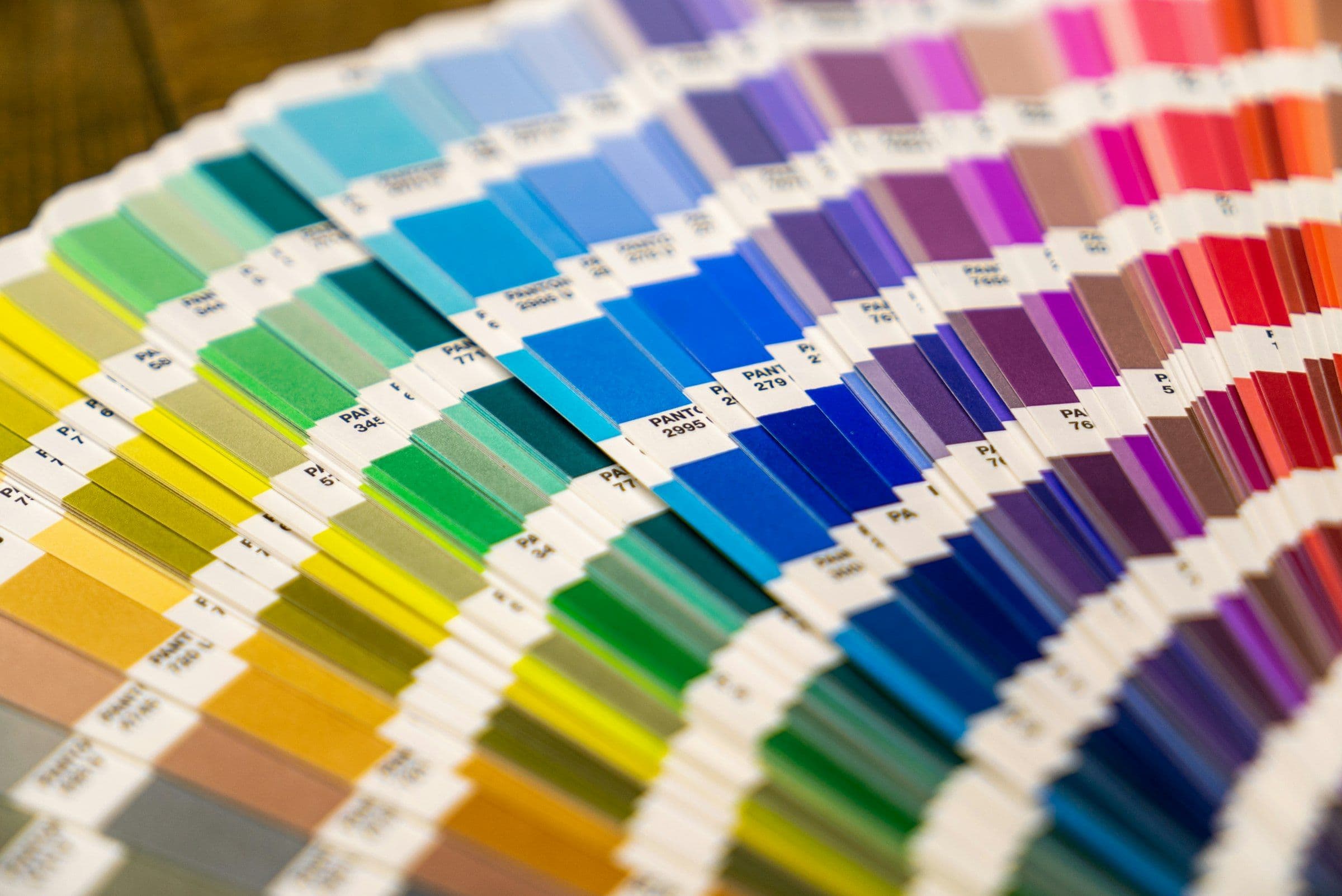
Early in a project, colours tend to get typed straight into components: a hex code here, a slightly different one there. It works until someone asks for dark mode, or a button fails a contrast check, and you discover the same blue in forty places.
I work on Drivio, a React Native app for driving instructors, at Lunova, and its colours come from design tokens. This guide walks through how to structure React Native design tokens, the rules worth writing into them, and one honest lesson: having dark-mode tokens isn’t the same as having dark mode. The palette and code here are illustrative, not Drivio’s own.
Key takeaways
- Define each token once, in a source file. Generate everything else, and fail CI if the generated files are out of date.
- Use three layers: raw colour ramps, then semantic tokens with light and dark values, then aliases for older names.
- Pair every background token with an “on” token, and test the contrast of every pair automatically.
- Write rules and deliberate exceptions into the token file, so nobody “fixes” them later.
- Test dark mode end to end before shipping it. Tokens are only half of the job.
What a design token is
A design token is a named design decision: a colour, a spacing value, a font size. Instead of a hex code, a component asks for primary. Change the token and every button changes with it. The Design Tokens Format Module defines a token as “information associated with a human readable name”.
Tokens are now standardised too. In October 2025 the W3C Design Tokens Community Group announced the first stable version of the specification, saying it “unlocks interoperability across design tools and code”. You don’t need the standard to get the benefits, but it’s worth knowing about if designers and developers share tokens across tools.
One source file, generated outputs
Keep every colour in one JSON file and generate the rest from it. In a React Native app styled with a Tailwind-style library such as NativeWind, a build script typically produces three outputs:
- CSS variables, with one block for light mode and one for dark, for the styling library to read.
- A TypeScript file of hex values, for code that needs a colour at runtime.
- A theme config, so class names like
bg-primaryandtext-on-dangerexist.
Nobody edits the generated files by hand. A CI step regenerates them and fails if the committed versions are stale, so the JSON file stays the single source of truth. Here is a simplified version of that file:
{
  "ramp": {
    "brand":   { "50": "#EEF3FF", "300": "#9DB4F5", "600": "#2B4DB8", "900": "#1B2A63" },
    "signal":  { "300": "#6EDCC0", "600": "#0E8A71" },
    "neutral": { "50": "#F6F7F9", "900": "#151A23" }
  },
  "semantic": {
    "primary":           { "light": "{ramp.brand.600}", "dark": "{ramp.brand.300}" },
    "on-primary":        { "light": "#FFFFFF", "dark": "#0F1A40" },
    "signal":            { "light": "{ramp.signal.600}", "dark": "{ramp.signal.300}",
                           "$comment": "Status and progress only. Never body text, never the only signal." },
    "booking-confirmed": { "light": "{ramp.brand.900}", "dark": "{ramp.brand.300}" },
    "app-background":    { "light": "#F5F5F4", "dark": "{ramp.neutral.900}",
                           "$comment": "Deliberately neutral, not a ramp reference. Do not tidy it into one." }
  },
  "alias": {
    "background":   "{semantic.app-background}",
    "primary-tint": { "from": "{semantic.primary}", "alpha": 0.12 }
  }
}
Three layers of design tokens
Ramps are the raw palette. Each is a series of shades from very light (50) to very dark (900):
Semantic tokens describe purpose. Each has a light value and a dark value, usually pointing at a ramp stop:
Let the domain name some tokens. In a booking app, confirmed, completed, no-show and cancelled bookings can each have their own token, so the calendar reads the same on every screen.
Role aliases are the third layer. Older screens often use Tailwind and shadcn-style names like background, card and muted-foreground. Map each onto a semantic token rather than renaming everything at once. Some can be derived, such as primary-tint at 12% opacity.
The background plus “on” pairing mirrors Material Design 3. Google’s Material 3 theming codelab describes On Primary as the role for UI elements placed on top of elements assigned Primary, and warns not to mix up corresponding roles because it “could result in accessibility loss”.
Rules and deliberate exceptions
Some colours carry rules. A bright signal colour for progress and status is useful, but keep it out of commands and body text, and never let it be the only signal. The numbers show why. WCAG’s contrast minimum asks for at least 4.5:1 between normal text and its background, while non-text contrast asks for 3:1 for interface components. The light signal token above is about 4.3:1 on white: fine for a status indicator, not enough for a paragraph.
Write the exceptions down as well. A ramp with a slight blue tint won’t suit every surface, and a truly neutral background may need a plain value instead of a ramp reference. Put the reason beside it, as the $comment fields in the file above do, and say outright not to tidy it into a ramp reference. Without that note, the first tidy-up pass will “fix” it.
Contrast as an automated test
Because every background has an “on” partner, contrast can be checked automatically. This is the WCAG formula for relative luminance and contrast ratio, in a few lines:
// Relative luminance and contrast ratio, as WCAG 2.2 defines them.
function channel(value: number): number {
  const s = value / 255
  return s <= 0.04045 ? s / 12.92 : ((s + 0.055) / 1.055) ** 2.4
}

function luminance(hex: string): number {
  const [r, g, b] = [1, 3, 5].map((i) => channel(parseInt(hex.slice(i, i + 2), 16)))
  return 0.2126 * r + 0.7152 * g + 0.0722 * b
}

export function contrast(a: string, b: string): number {
  const [light, dark] = [luminance(a), luminance(b)].sort((x, y) => y - x)
  return (light + 0.05) / (dark + 0.05)
}
A test then checks every pairing in both modes, so a colour change that breaks one fails the build:
import { tokens } from './tokens.generated'

const PAIRS = [
  ['primary', 'on-primary'],
  ['danger', 'on-danger'],
  ['surface', 'text-primary'],
] as const

describe.each(['light', 'dark'] as const)('%s mode', (mode) => {
  test.each(PAIRS)('%s / %s meets 4.5:1', (background, foreground) => {
    const ratio = contrast(tokens[mode][background], tokens[mode][foreground])
    expect(ratio).toBeGreaterThanOrEqual(4.5)
  })
})Notice how on-primary flips from white in light mode to a deep blue in dark mode. A lighter blue works better as a button on a dark screen, so the text on it has to change too. The pairing is decided once, in the token file, not in every component.
Using design tokens in React Native components
Most components use the generated class names, so a button’s variants are written entirely in tokens:
// Every variant is written in tokens, never hex codes.
const VARIANTS = {
  primary: { base: 'bg-primary', pressed: 'bg-primary-pressed', label: 'text-on-primary' },
  danger:  { base: 'bg-danger',  pressed: 'bg-danger-pressed',  label: 'text-on-danger' },
} as const satisfies Record<string, { base: string; pressed: string; label: string }>
Some props can’t take a class name: an Android ripple, a spinner’s tint, an icon. For those, a small hook built on React Native’s useColorScheme returns the right set of values for the current mode:
import { useColorScheme } from 'react-native'
import { palette } from './tokens.generated'

// For props that can't take a class name: ripple colours, spinner tints, icon colours.
export function usePalette() {
  return useColorScheme() === 'dark' ? palette.dark : palette.light
}
Either way, components ask for a purpose, not a hex code.
Design tokens and dark mode: why we shipped light first
Every semantic token can have a dark value and the generated CSS can have a dark block, and dark mode can still not work. When we tested dark mode end to end, some surfaces switched and others didn’t, leaving dark headers over light panels. That’s worse than no dark mode at all, so the first release ships in light mode only.
In an Expo app, the colour themes guide covers this with userInterfaceStyle in the app config, where 'light' will “restrict the app to support light theme only”. Note that Android development builds need expo-system-ui, or the setting is ignored. Then check that class names and runtime colours really follow the same scheme.
The tokens are ready. When the styling pipeline is too, turning dark mode on should mean fixing that pipeline and flipping a flag, not redesigning the colours.
Naming design tokens: what we learned
- Name by purpose, not appearance.
primarysurvives a rebrand;button-bluedoesn’t. - Pair every background role with an “on” role, so text colour is never a guess.
- Let the domain name some tokens.
booking-cancelledis clearer thangrey-4. - Keep old names as aliases while you migrate, rather than renaming everything at once.
Nathan Curtis’s Naming Tokens in Design Systems is the best longer read. It describes tokens as a way to “centrally record and widely reuse purposeful visual decisions”.
A design system that scales with your app
Good tokens make rebrands, dark mode and accessibility fixes a one-file change. The rest of this series covers React Native time zones in a booking app and how to prevent double bookings. Lunova Labs sets up design systems like this as part of iOS and Android app development.


Ready when you are